A brand built around the joy of showing up
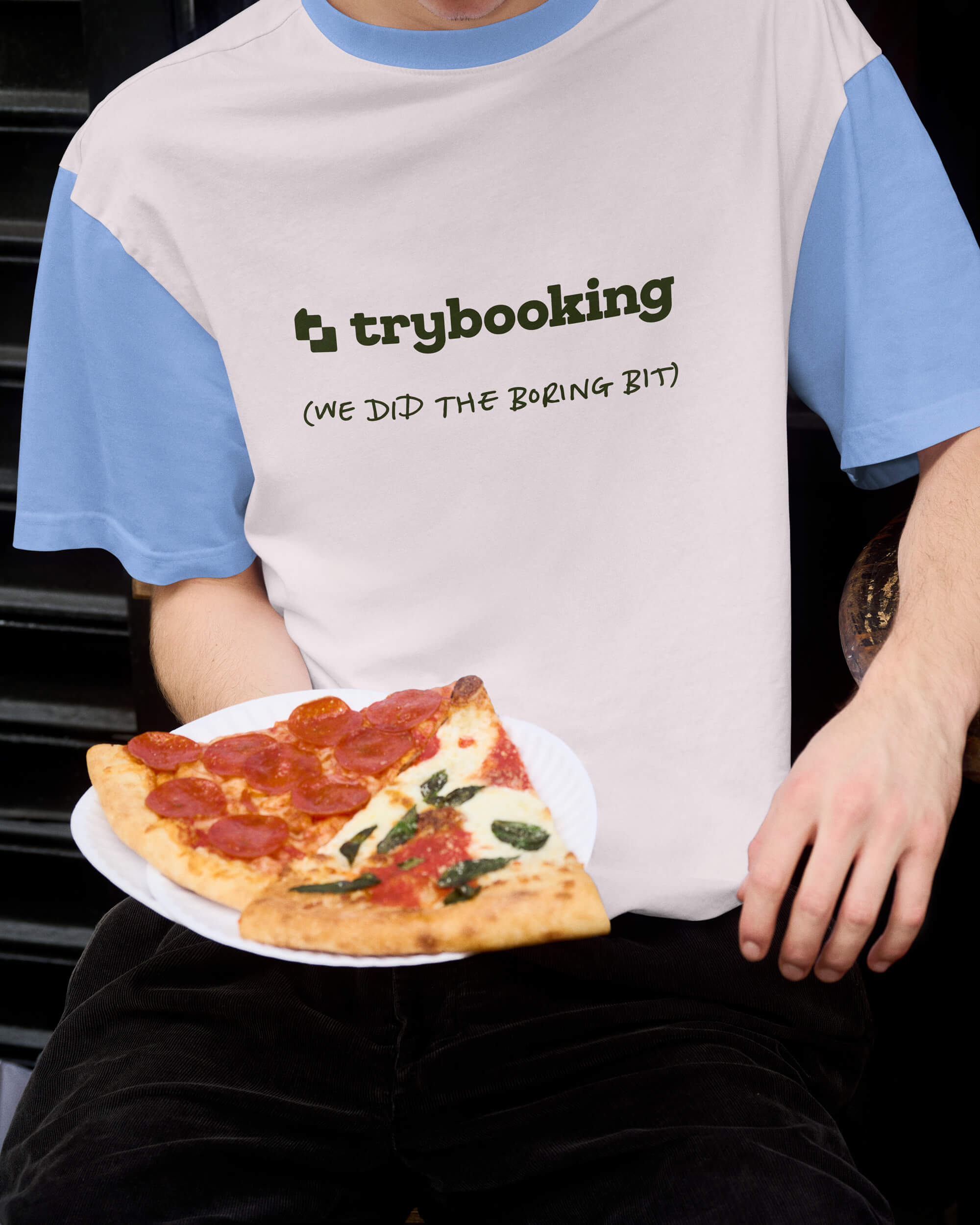
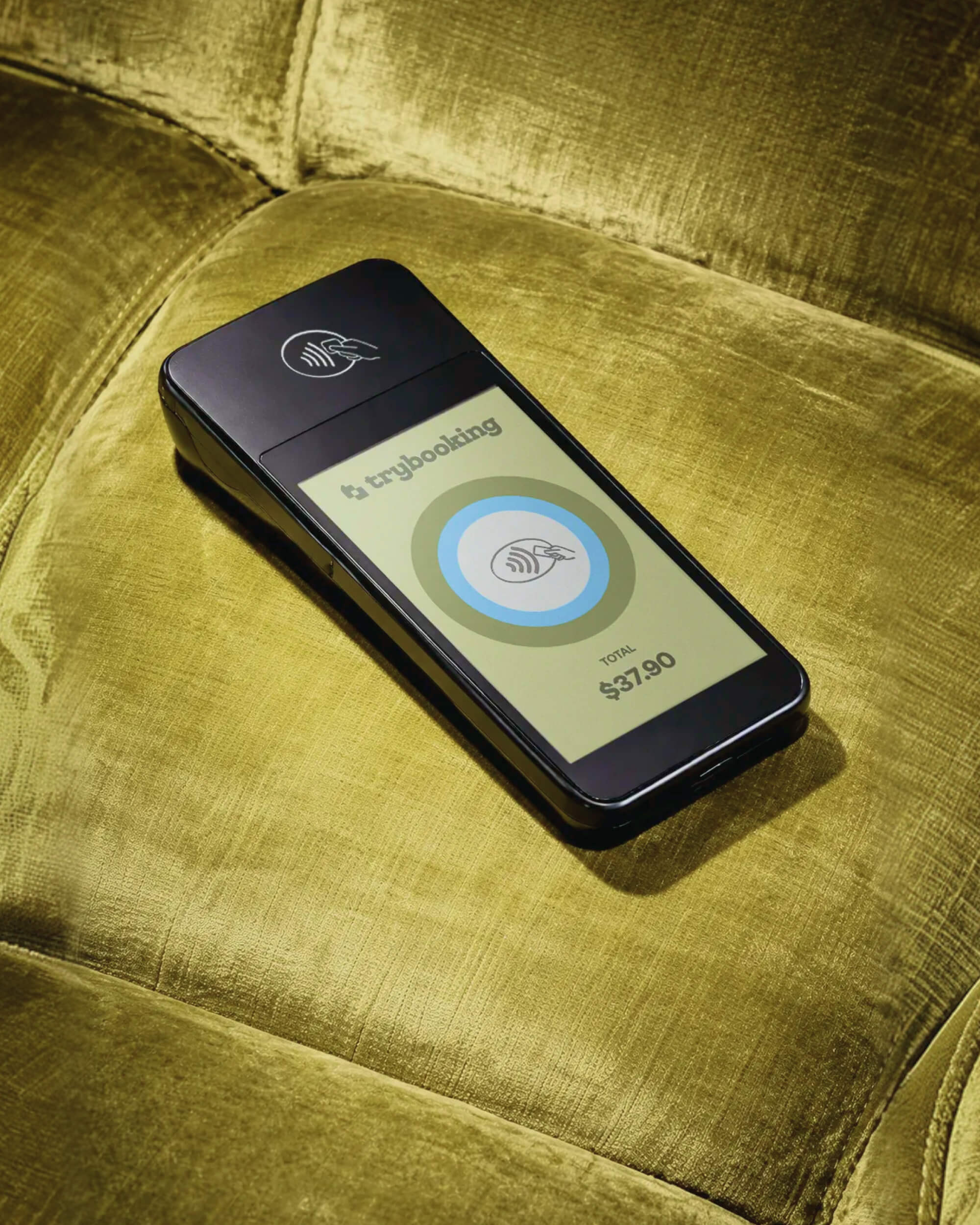
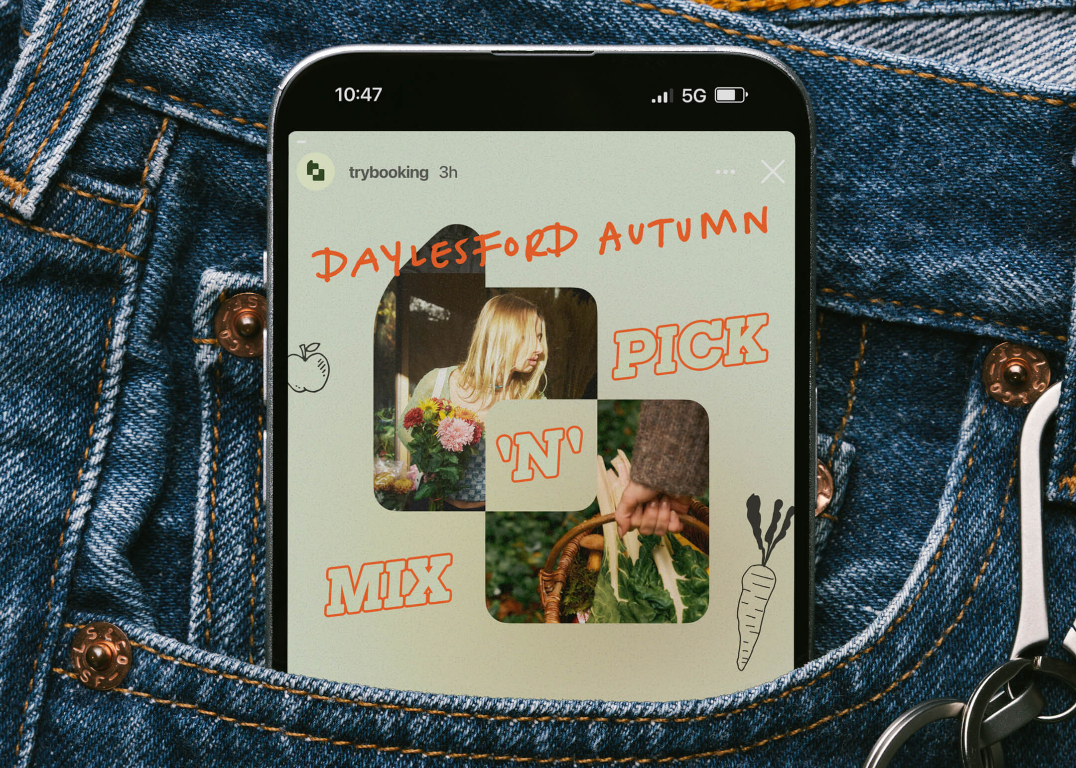
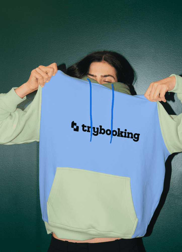
TryBooking is an events and ticketing platform that helps people bring audiences together, from school concerts and fundraisers to theatre, festivals and workshops. As the sole designer, working closely with the Head of Marketing, I developed a refreshed brand identity that better reflected the fun, colour and human energy of events. The logo was designed to read as both a t and a b, while also representing two parts coming together to create something greater than the sum of its parts. It also hints at the gesture of framing a moment with your fingers, tying the identity to photos, memories and the feeling of capturing something as it happens.
A brand built around the joy of showing up
TryBooking is an events and ticketing platform that helps people bring audiences together, from school concerts and fundraisers to theatre, festivals and workshops. As the sole designer, working closely with the Head of Marketing, I developed a refreshed brand identity that better reflected the fun, colour and human energy of events. The logo was designed to read as both a t and a b, while also representing two parts coming together to create something greater than the sum of its parts. It also hints at the gesture of framing a moment with your fingers, tying the identity to photos, memories and the feeling of capturing something as it happens.
Direction
Real moments beat polished perfection
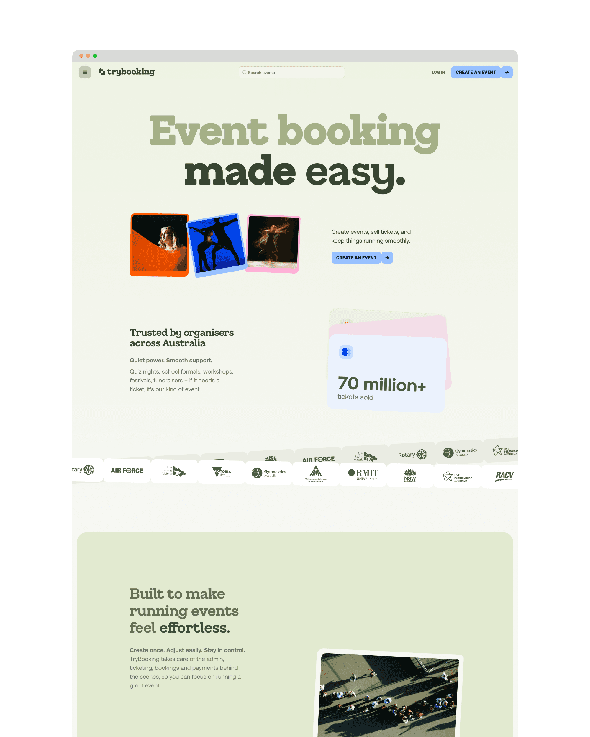
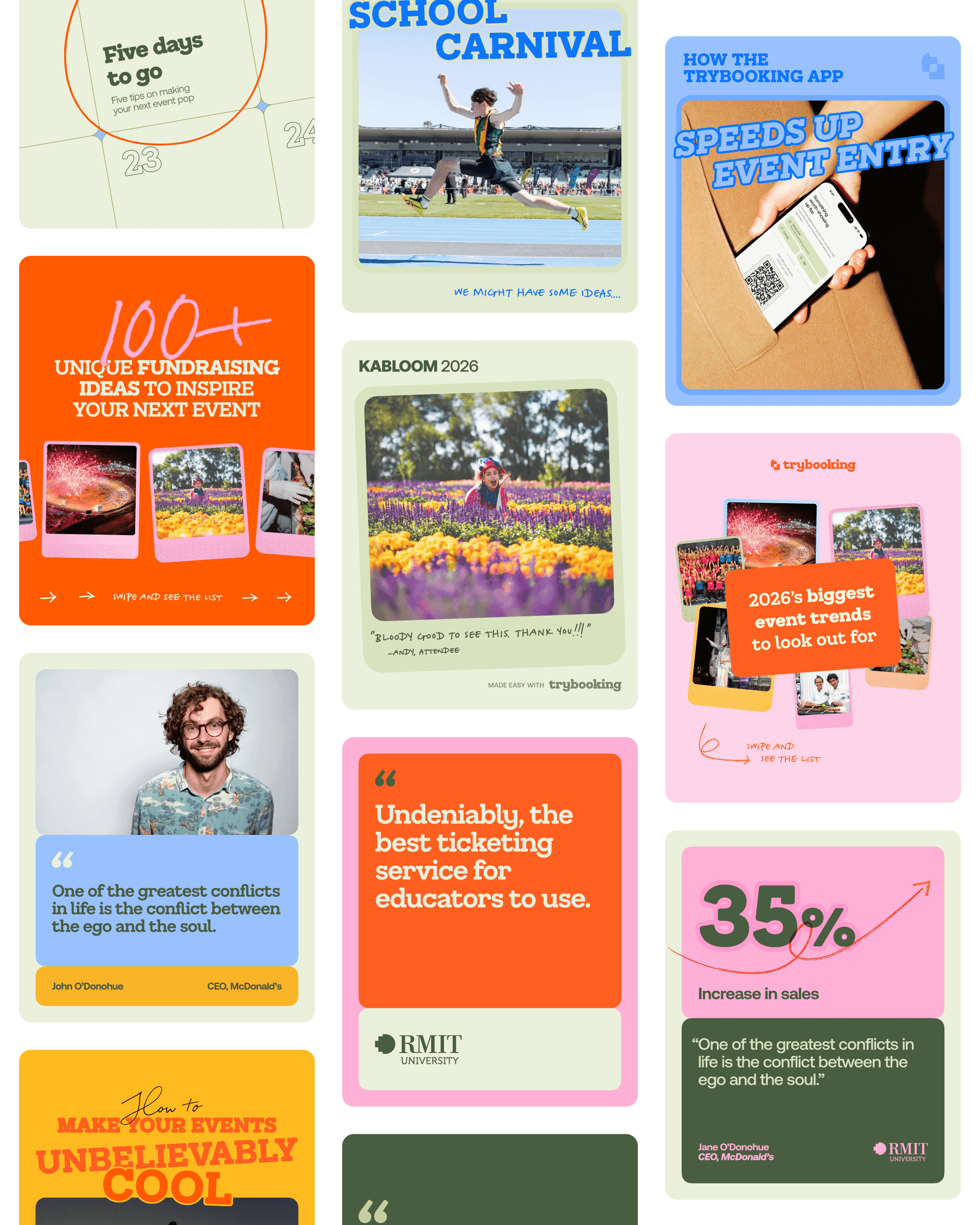
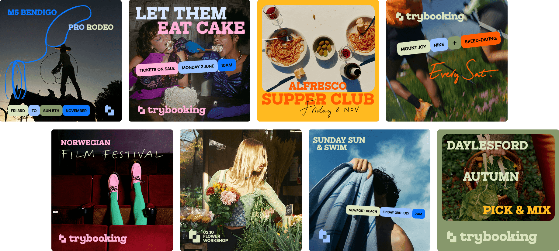
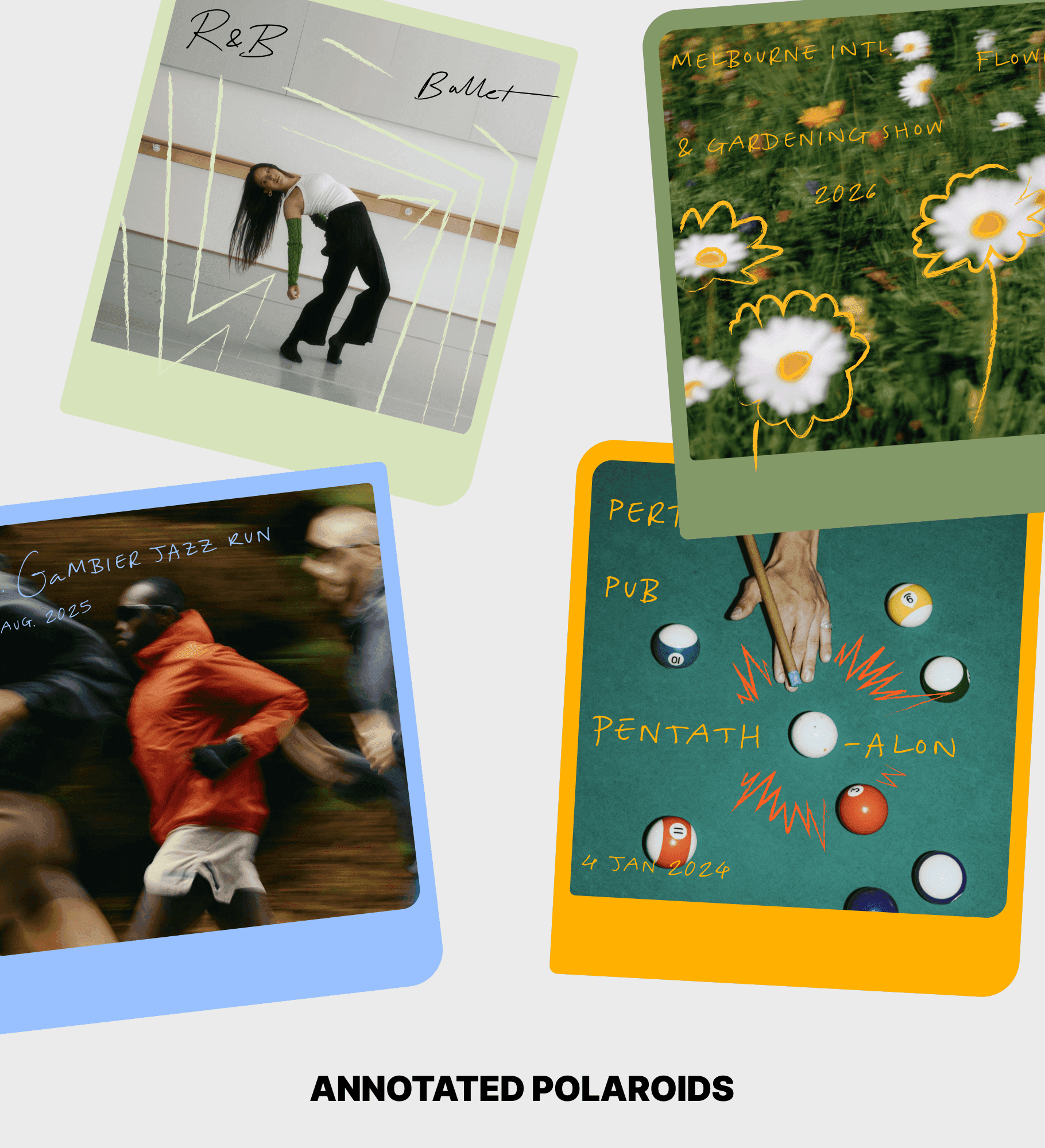
The creative direction embraced real event photography over glossy, generic or AI-looking imagery. The brand leans into user-generated content: flash-heavy, imperfect, energetic photos that feel like they were taken by people who were actually there. This became a way to celebrate in-person connection, which is ultimately what TryBooking helps support. Photos are framed like polaroids in brand colours, with doodles and graphic details layered over the top to turn everyday event shots into branded moments, accentuating movement, emotion or the theme of the event.
Direction
Real moments beat polished perfection
The creative direction embraced real event photography over glossy, generic or AI-looking imagery. The brand leans into user-generated content: flash-heavy, imperfect, energetic photos that feel like they were taken by people who were actually there. This became a way to celebrate in-person connection, which is ultimately what TryBooking helps support. Photos are framed like polaroids in brand colours, with doodles and graphic details layered over the top to turn everyday event shots into branded moments, accentuating movement, emotion or the theme of the event.
Graphic treatment
Ticket stubs, playbills and paper-stock nostalgia
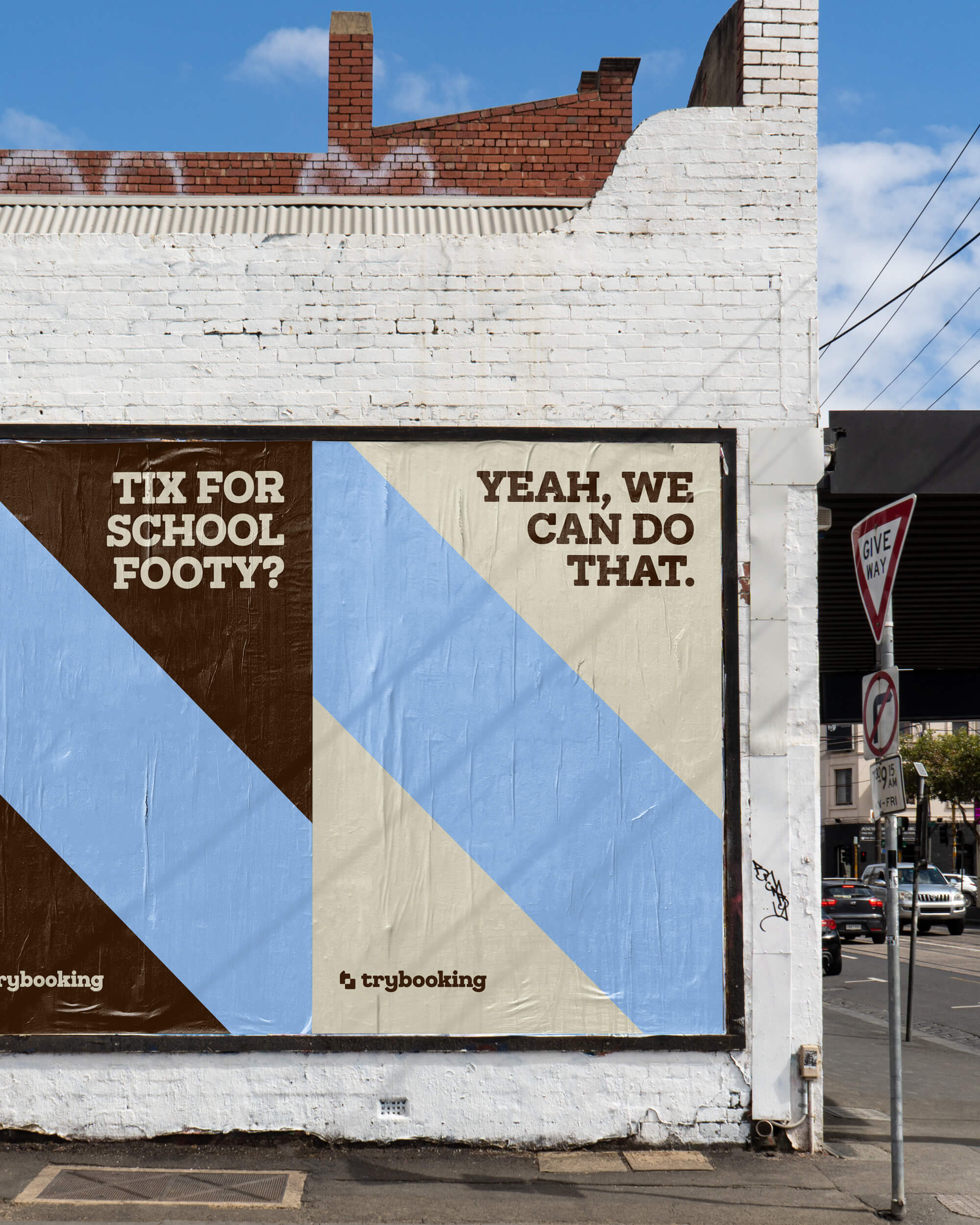
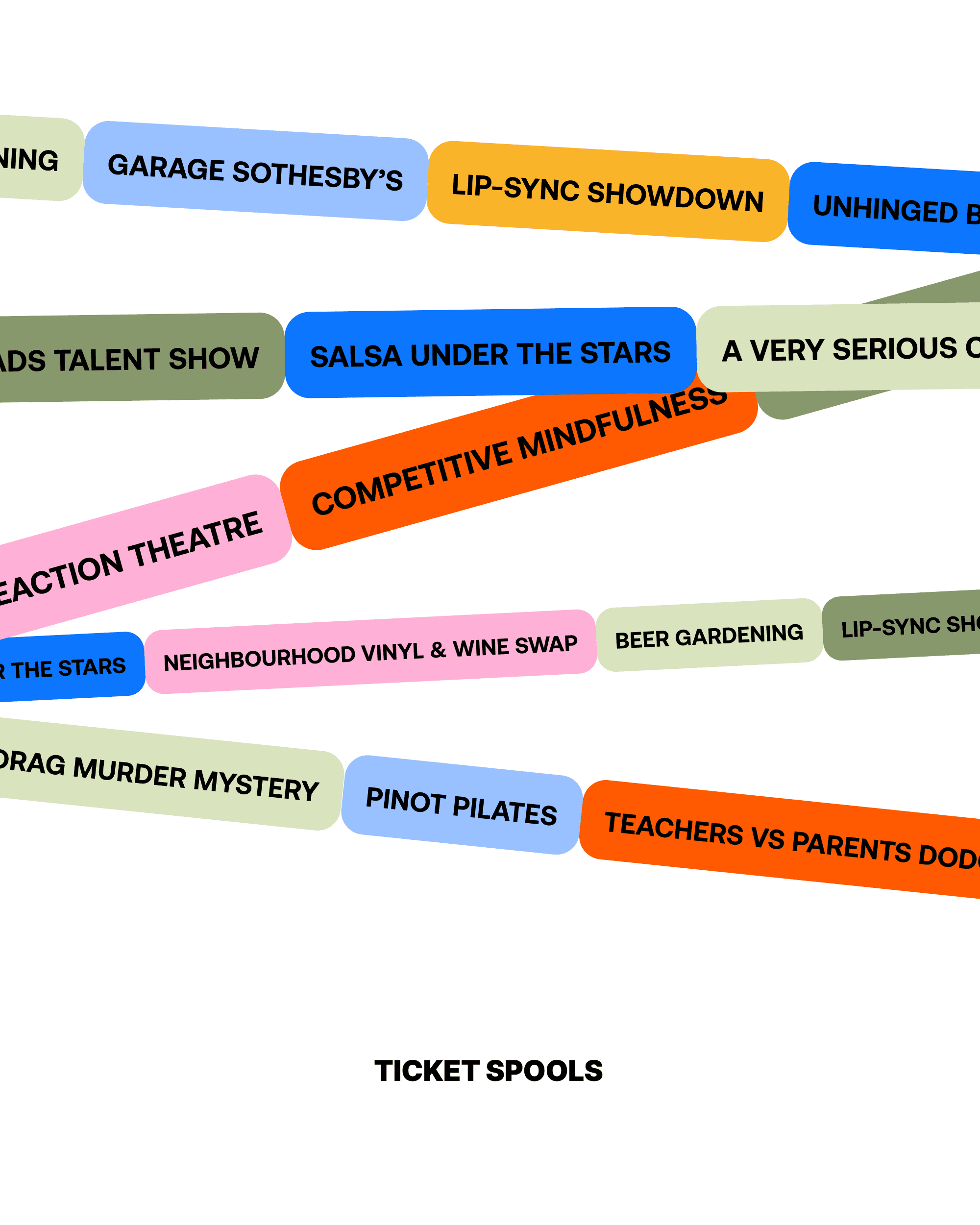
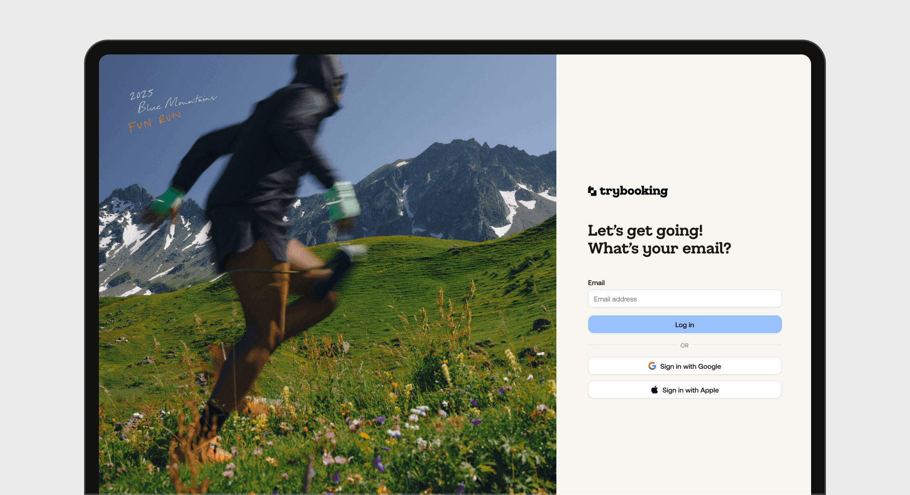
The broader visual system was inspired by the physical history of events: old playbills, printed tickets, paper flyers and colourful pre-CMYK paper stocks. The display typeface is a softened slab serif that updates the existing brand into something more modern and distinctive, while still nodding to tickets and keepsakes people once collected from concerts and shows. Graphic treatments use the idea of ticket spools, with pill-shaped text blocks that feel like they could break off from a roll of tickets and flex across campaign assets, social content and even UI layouts.
Graphic treatment
Ticket stubs, playbills and paper-stock nostalgia
The broader visual system was inspired by the physical history of events: old playbills, printed tickets, paper flyers and colourful pre-CMYK paper stocks. The display typeface is a softened slab serif that updates the existing brand into something more modern and distinctive, while still nodding to tickets and keepsakes people once collected from concerts and shows. Graphic treatments use the idea of ticket spools, with pill-shaped text blocks that feel like they could break off from a roll of tickets and flex across campaign assets, social content and even UI layouts.