Prospectus, packaging, catalogues and fact-sheets
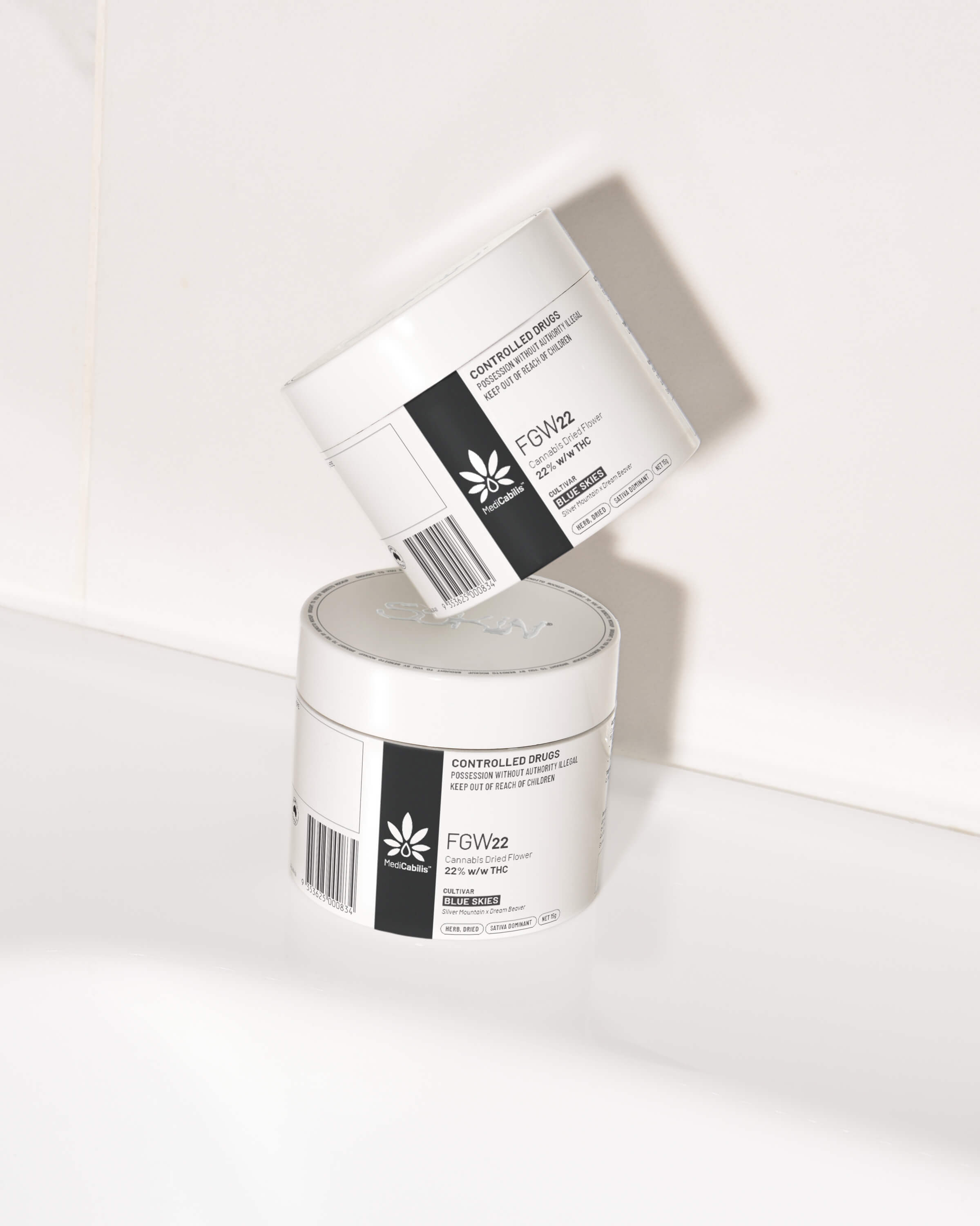
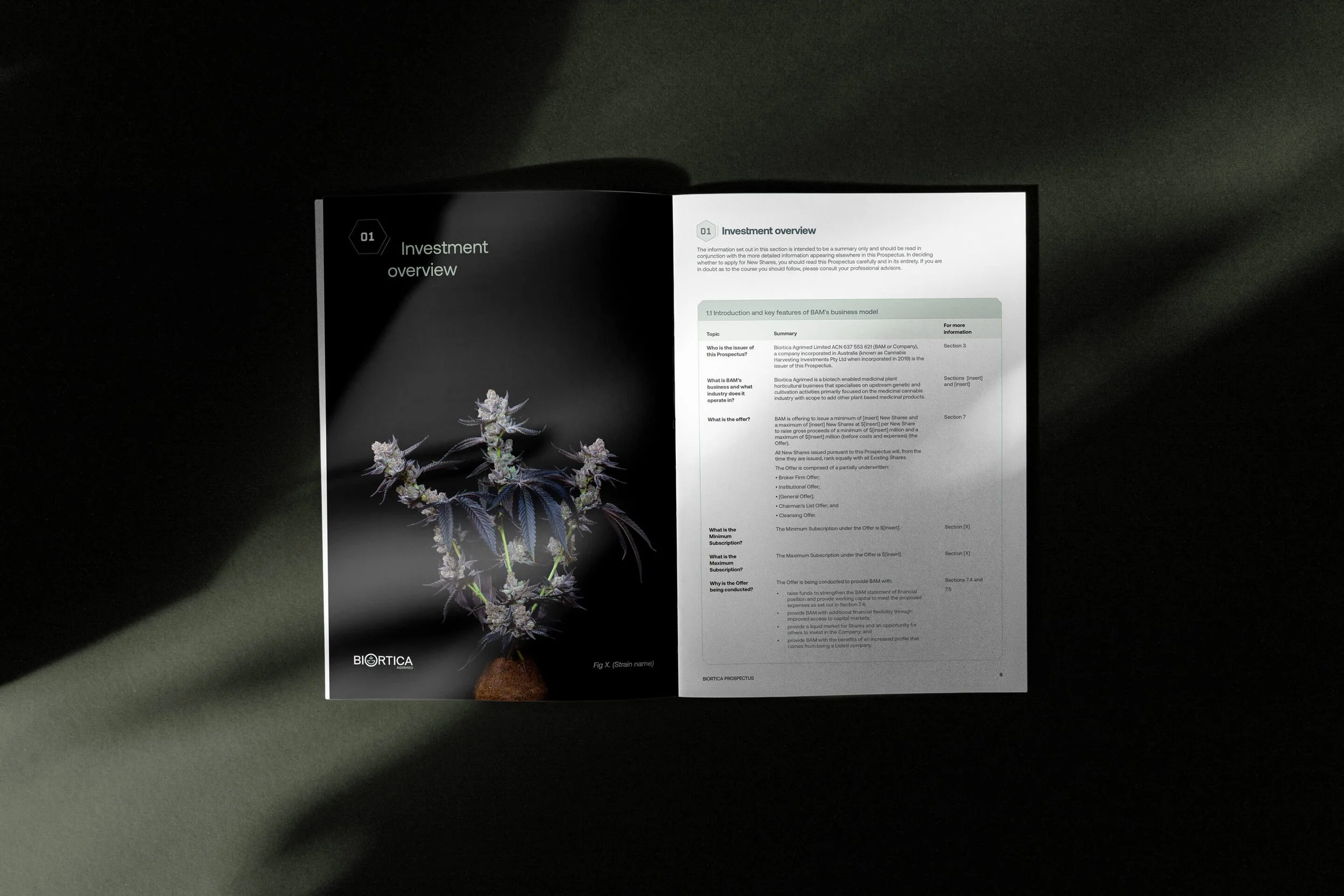
Biortica and its subsidiary Medicabilis needed a design language that felt sharp, credible and highly controlled. The Biortica IPO prospectus used a clean Swiss-inspired approach, with strong grids, restrained typography and a minimal visual system to help the company feel investor-ready, clinical and commercially mature. For Medicabilis, the same design discipline was carried into the packaging, where the challenge was to create something distinctive within the strict labelling requirements of medicinal cannabis pharmaceuticals.
Prospectus, packaging, catalogues and fact-sheets
Biortica and its subsidiary Medicabilis needed a design language that felt sharp, credible and highly controlled. The Biortica IPO prospectus used a clean Swiss-inspired approach, with strong grids, restrained typography and a minimal visual system to help the company feel investor-ready, clinical and commercially mature. For Medicabilis, the same design discipline was carried into the packaging, where the challenge was to create something distinctive within the strict labelling requirements of medicinal cannabis pharmaceuticals.
Warmth inside a regulated category
Making medical cannabis feel considered, not cold
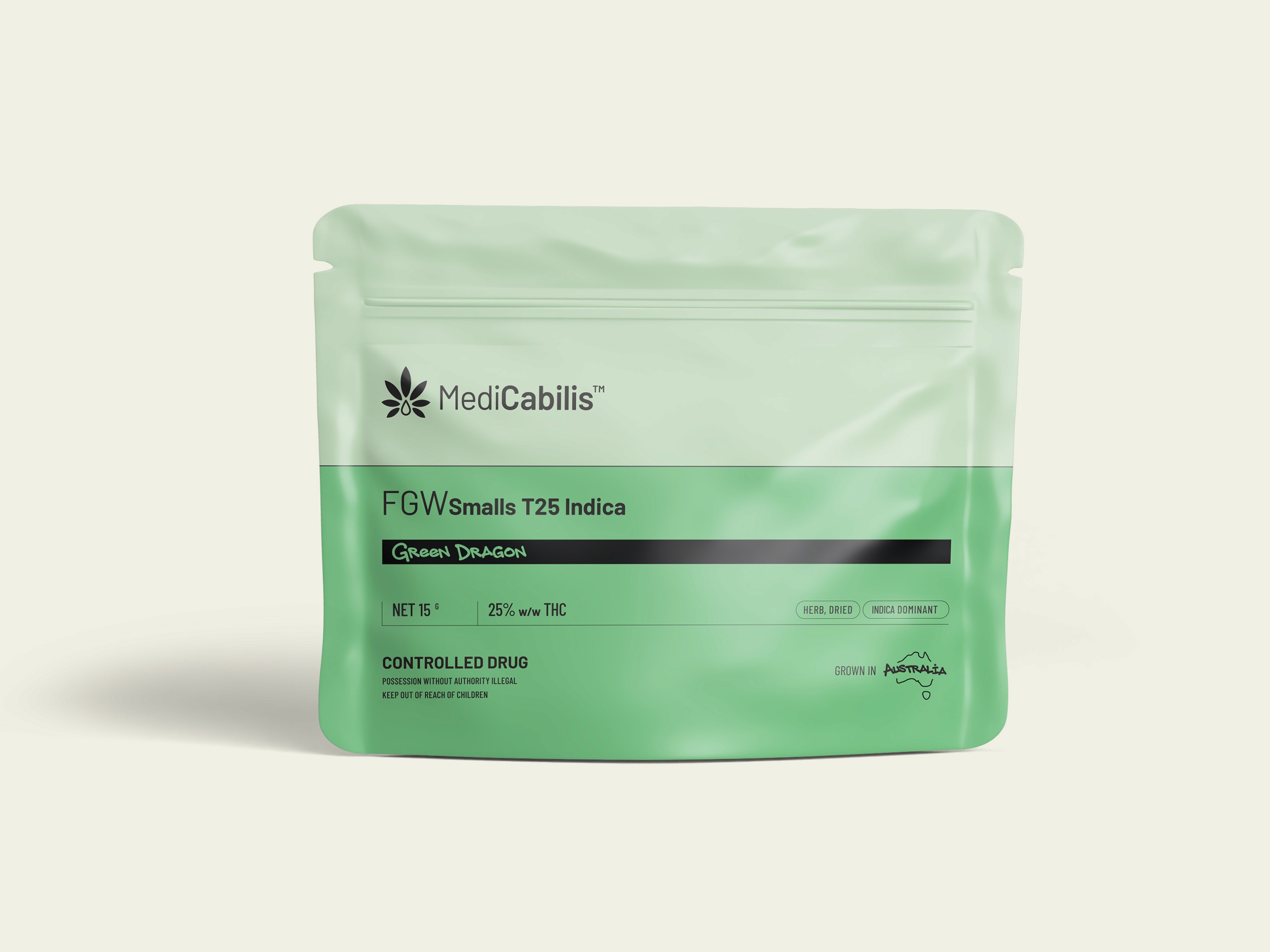
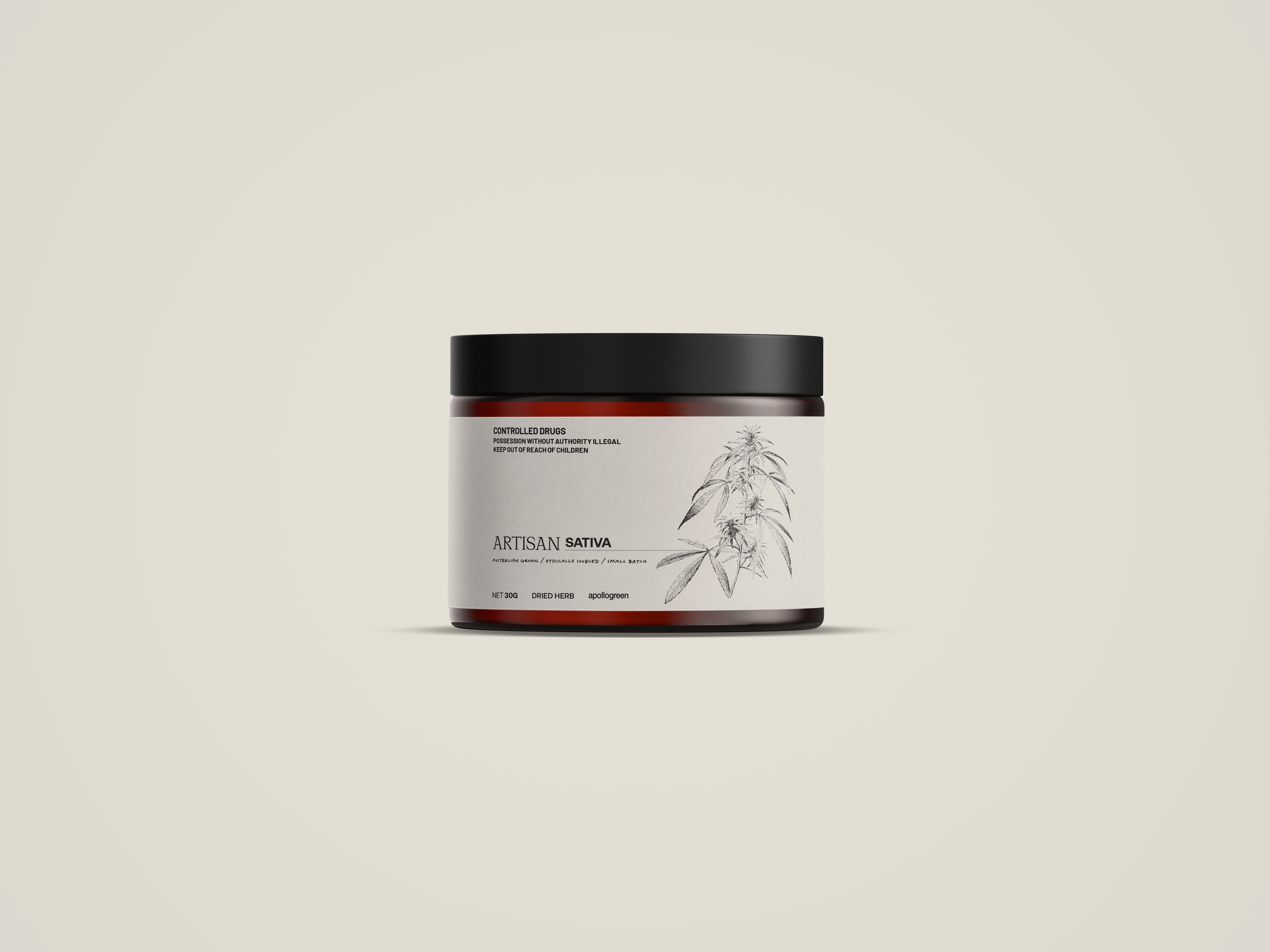
The Medicabilis packaging used warm colour palettes to soften the clinical nature of the category and create a more human connection, while still feeling precise, compliant and pharmaceutical. The warmth also helped nod to the plant-derived nature of the product without leaning on obvious cannabis clichés. For the FGW pouch designs, hand-script details were introduced to suggest small-batch care and a more crafted production process, balancing Swiss minimalism with just enough personality to make the brand feel considered, premium and quietly approachable.
Warmth inside a regulated category
Making medical cannabis feel considered, not cold
The Medicabilis packaging used warm colour palettes to soften the clinical nature of the category and create a more human connection, while still feeling precise, compliant and pharmaceutical. The warmth also helped nod to the plant-derived nature of the product without leaning on obvious cannabis clichés. For the FGW pouch designs, hand-script details were introduced to suggest small-batch care and a more crafted production process, balancing Swiss minimalism with just enough personality to make the brand feel considered, premium and quietly approachable.