A directionally clever mark for a practical building brand
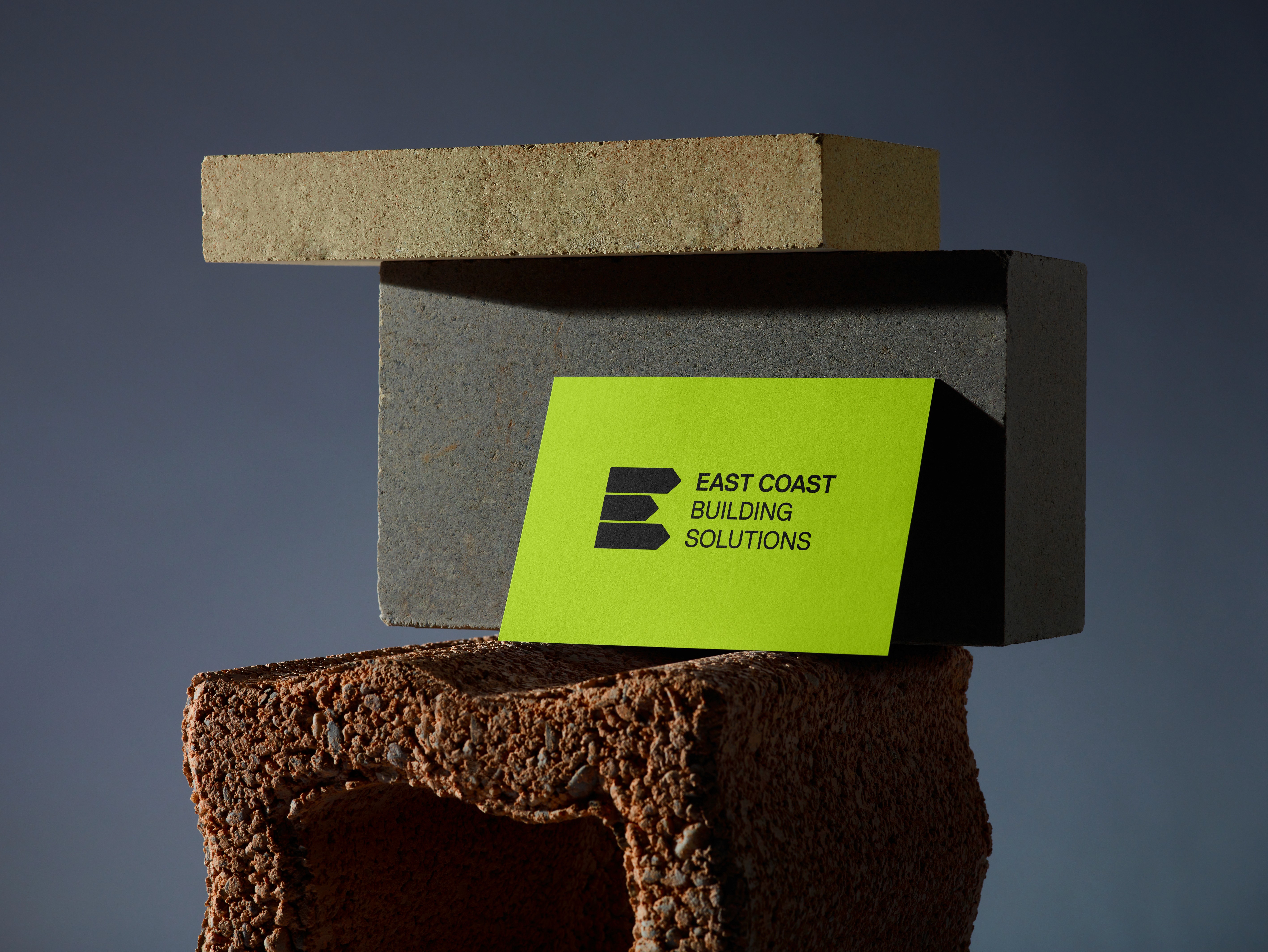
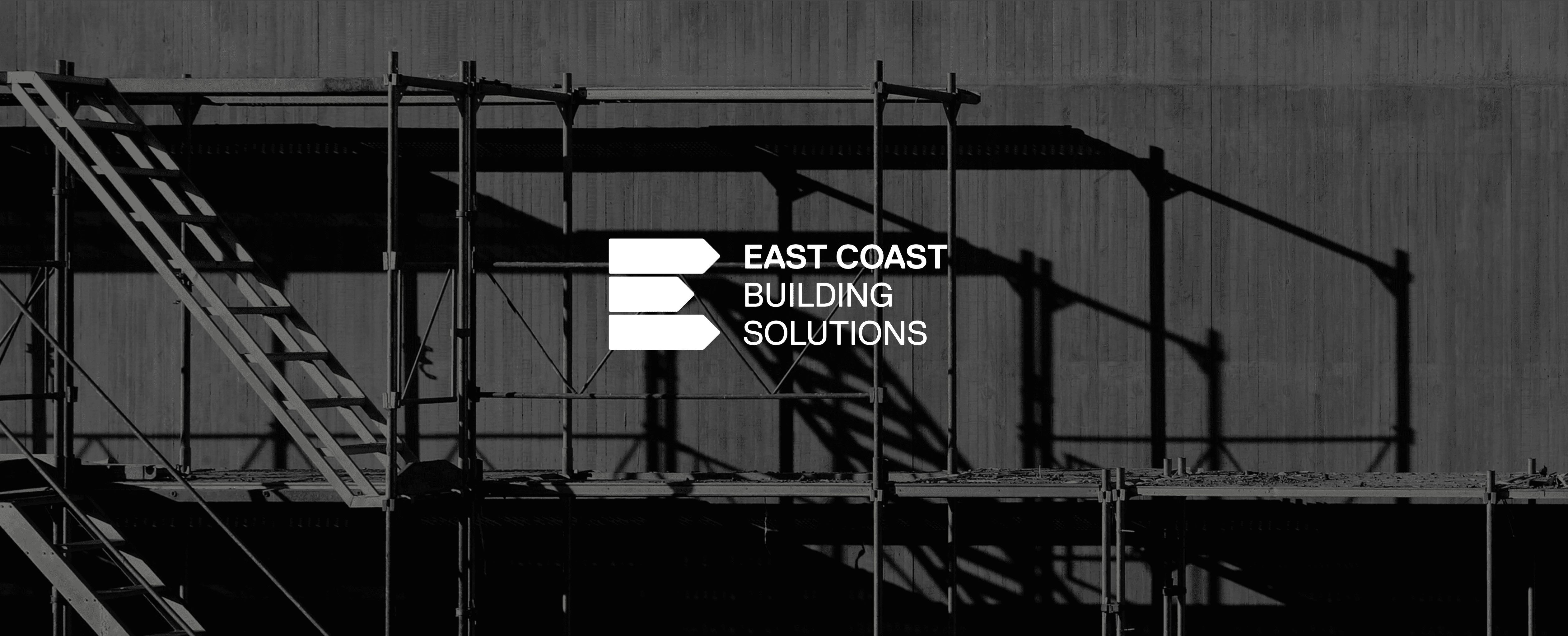
East Coast Building Solutions needed a mark that felt simple, sturdy and immediately recognisable. The custom E was designed to borrow from street signs, with each section pointing east as a subtle nod to the name. Built into the form is also the sideways silhouette of a house, giving the logo a clever second read without making it feel too literal or overworked.
A directionally clever mark for a practical building brand
East Coast Building Solutions needed a mark that felt simple, sturdy and immediately recognisable. The custom E was designed to borrow from street signs, with each section pointing east as a subtle nod to the name. Built into the form is also the sideways silhouette of a house, giving the logo a clever second read without making it feel too literal or overworked.
A clean identity that works hard on site
Built for high-vis, vehicles and real-world use
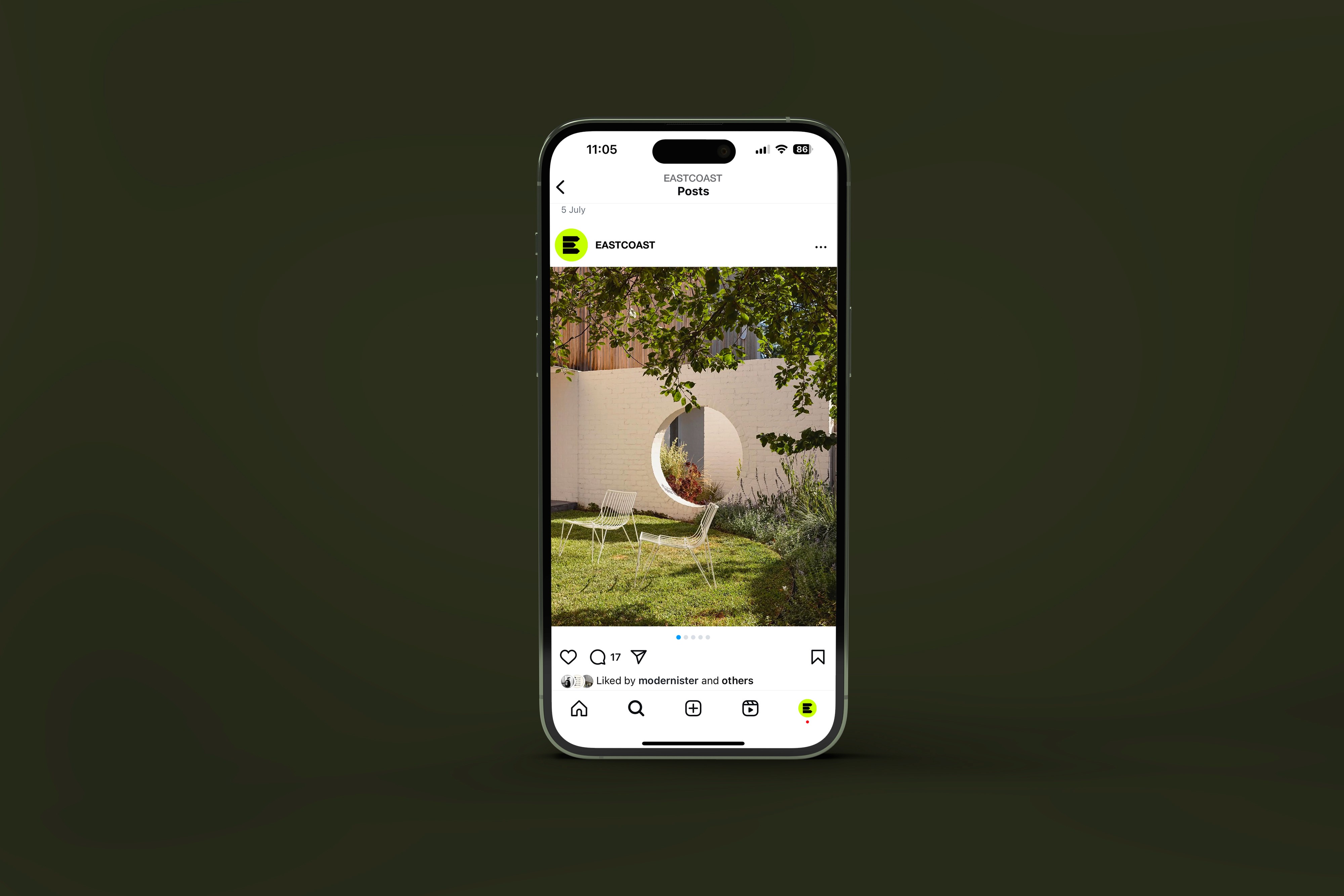
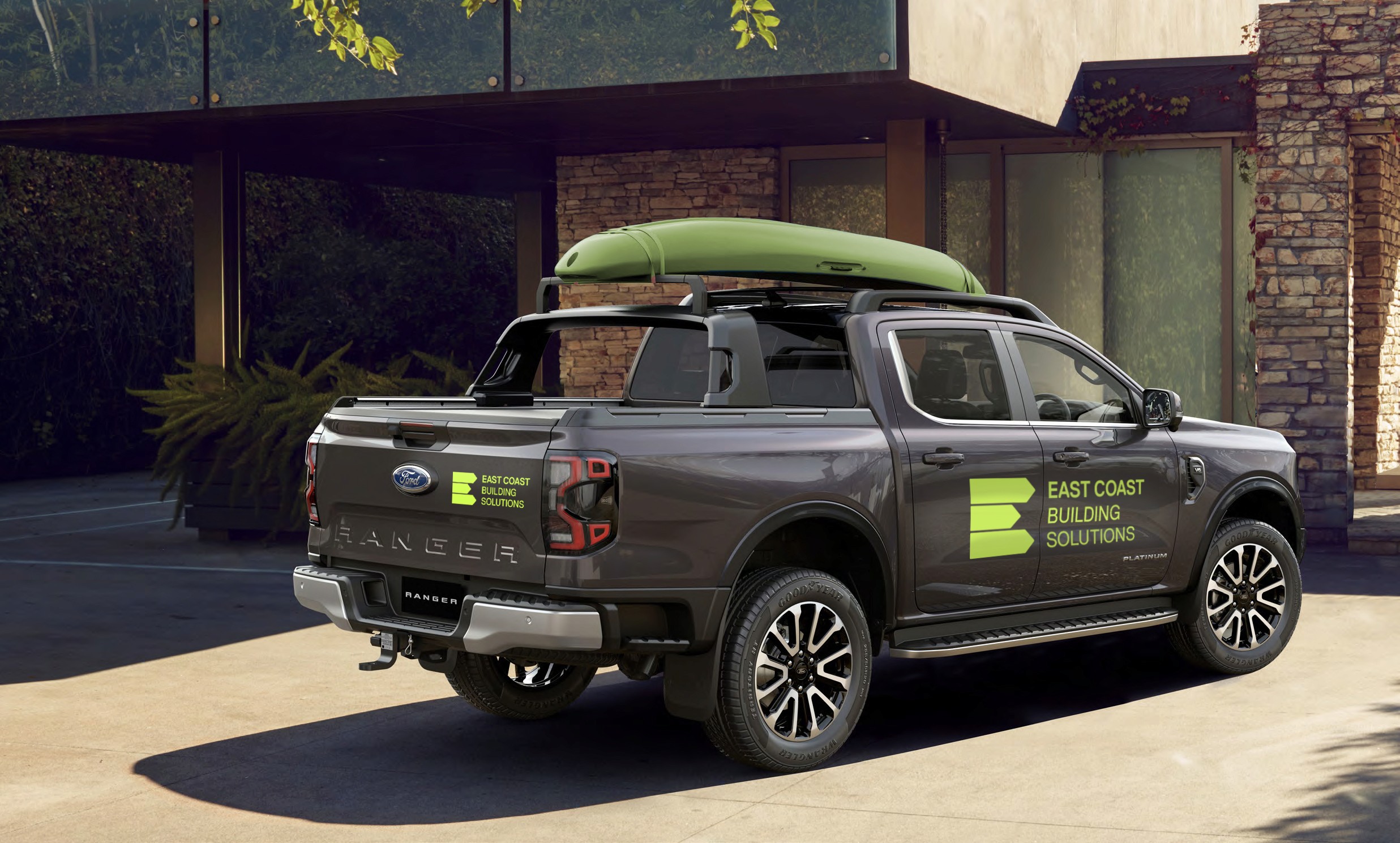
The broader identity keeps things bold, minimal and highly functional, making it easy to apply across vehicles, uniforms, signage, social content and site materials. The bright green gives the brand strong visibility in practical building environments, while the dark supporting palette keeps it grounded and professional. The result is a mark that feels sharp and memorable, but still tough enough for the day-to-day reality of the trade.
A clean identity that works hard on site
Built for high-vis, vehicles and real-world use
The broader identity keeps things bold, minimal and highly functional, making it easy to apply across vehicles, uniforms, signage, social content and site materials. The bright green gives the brand strong visibility in practical building environments, while the dark supporting palette keeps it grounded and professional. The result is a mark that feels sharp and memorable, but still tough enough for the day-to-day reality of the trade.