Creating a shared language for 3 very different brands
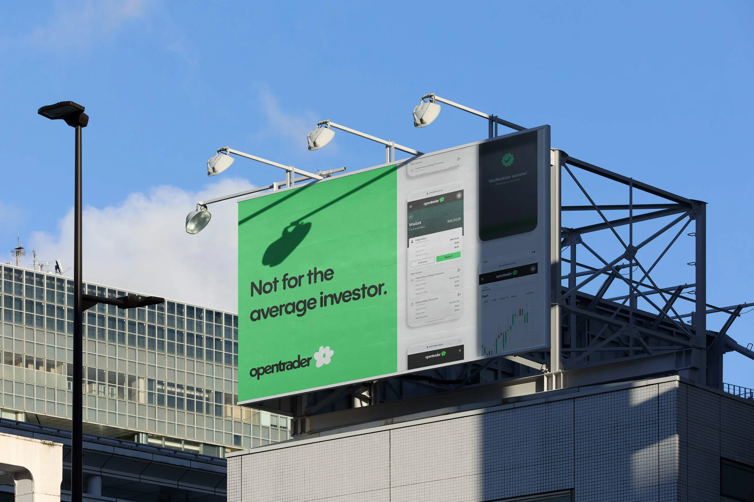
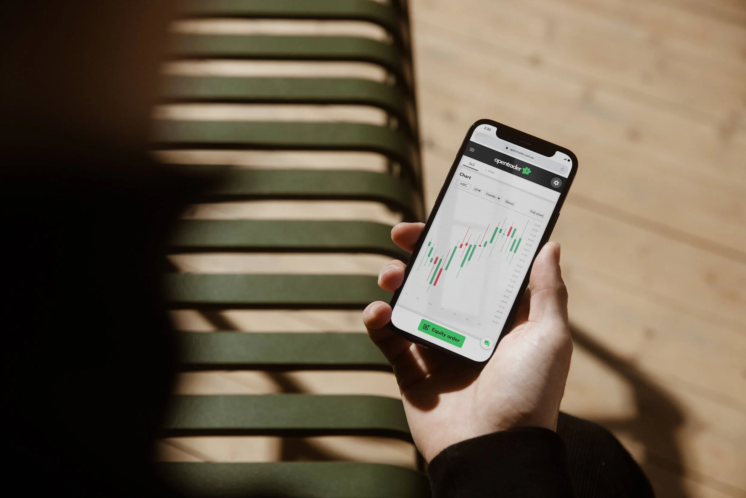
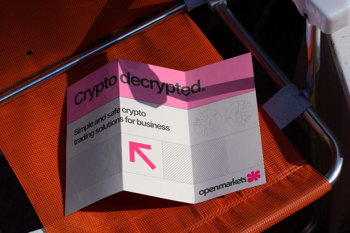
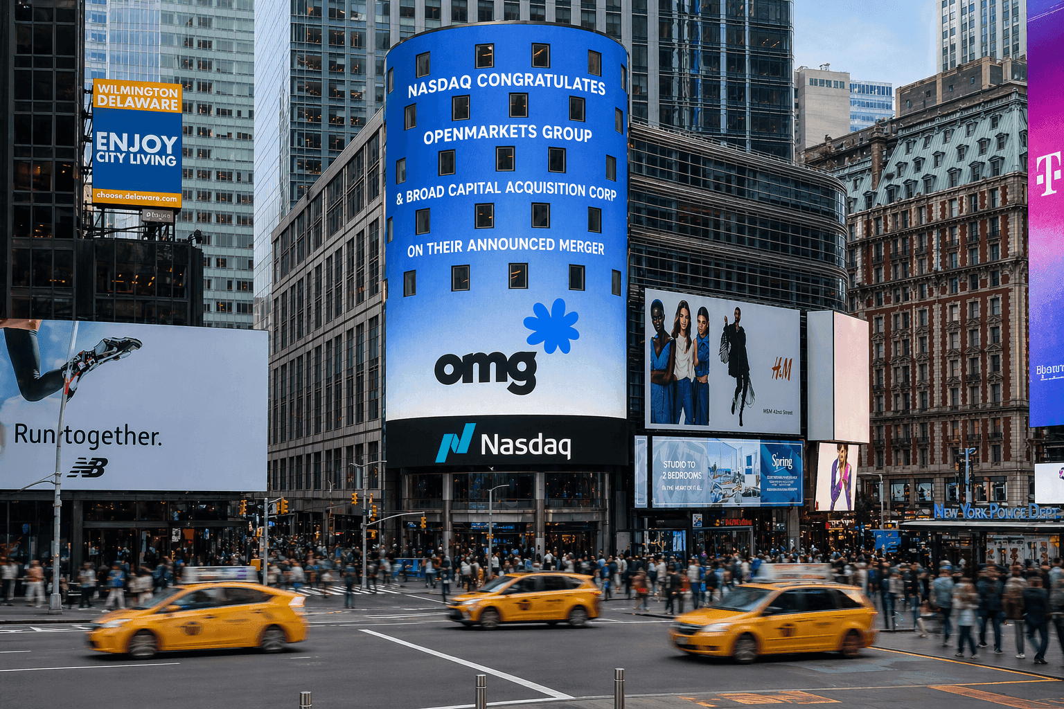
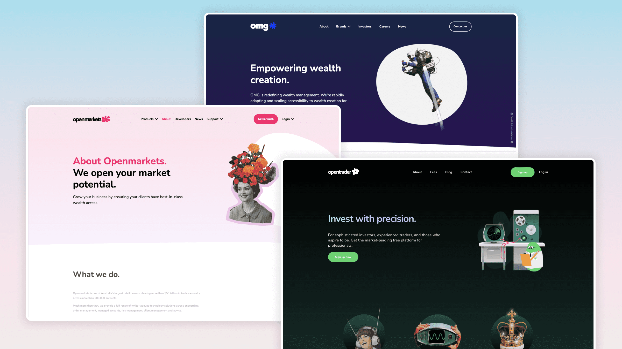
Openmarkets Group was a fast-growing FinTech scale-up spanning three brands: OMG, the investor-facing parent company; Openmarkets, the B2B SaaS platform providing clearing infrastructure for other FinTechs; and Opentrader, the B2C trading app. I helped consolidate their design language into a shared brand lexicon across logo stamps, illustration, photography, typography, collage, animation, UI and content, while keeping each branch distinct through its own primary colour and flower mark: blue for OMG, pink for Openmarkets and green for Opentrader. The hand-drawn floral system was a deliberate contrast to typical finance branding, bringing warmth, humanity and memorability to a category often dominated by cold blues, graphs and obvious symbolism.
Creating a shared language for 3 very different brands
Openmarkets Group was a fast-growing FinTech scale-up spanning three brands: OMG, the investor-facing parent company; Openmarkets, the B2B SaaS platform providing clearing infrastructure for other FinTechs; and Opentrader, the B2C trading app. I helped consolidate their design language into a shared brand lexicon across logo stamps, illustration, photography, typography, collage, animation, UI and content, while keeping each branch distinct through its own primary colour and flower mark: blue for OMG, pink for Openmarkets and green for Opentrader. The hand-drawn floral system was a deliberate contrast to typical finance branding, bringing warmth, humanity and memorability to a category often dominated by cold blues, graphs and obvious symbolism.
Creative direction
Making finance feel human, fast and impossible to ignore
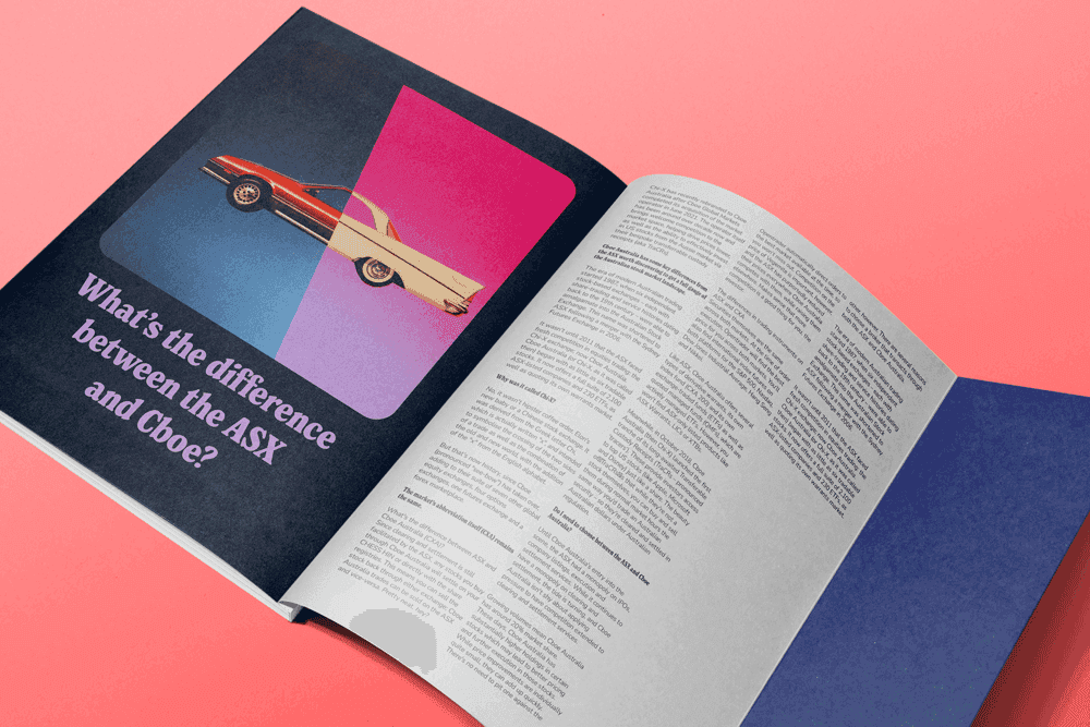
The visual direction leaned into retro collage, playful cut-outs and a slightly Monty Python-inspired sense of wit and movement. This gave the brand a timeless editorial quality, while also making it easy to produce high volumes of social, email, blog, campaign and internal content quickly. The system was designed to feel flexible rather than templated, allowing the brand to have fun where appropriate without losing trust or credibility. In a clinical finance landscape, the aim was to create a brand that could hold up in investor decks and corporate materials, while still feeling human, distinctive and impossible to confuse with every other FinTech.
Creative direction
Making finance feel human, fast and impossible to ignore
The visual direction leaned into retro collage, playful cut-outs and a slightly Monty Python-inspired sense of wit and movement. This gave the brand a timeless editorial quality, while also making it easy to produce high volumes of social, email, blog, campaign and internal content quickly. The system was designed to feel flexible rather than templated, allowing the brand to have fun where appropriate without losing trust or credibility. In a clinical finance landscape, the aim was to create a brand that could hold up in investor decks and corporate materials, while still feeling human, distinctive and impossible to confuse with every other FinTech.
Brand world and outcomes
From product uplift to a full-company identity system
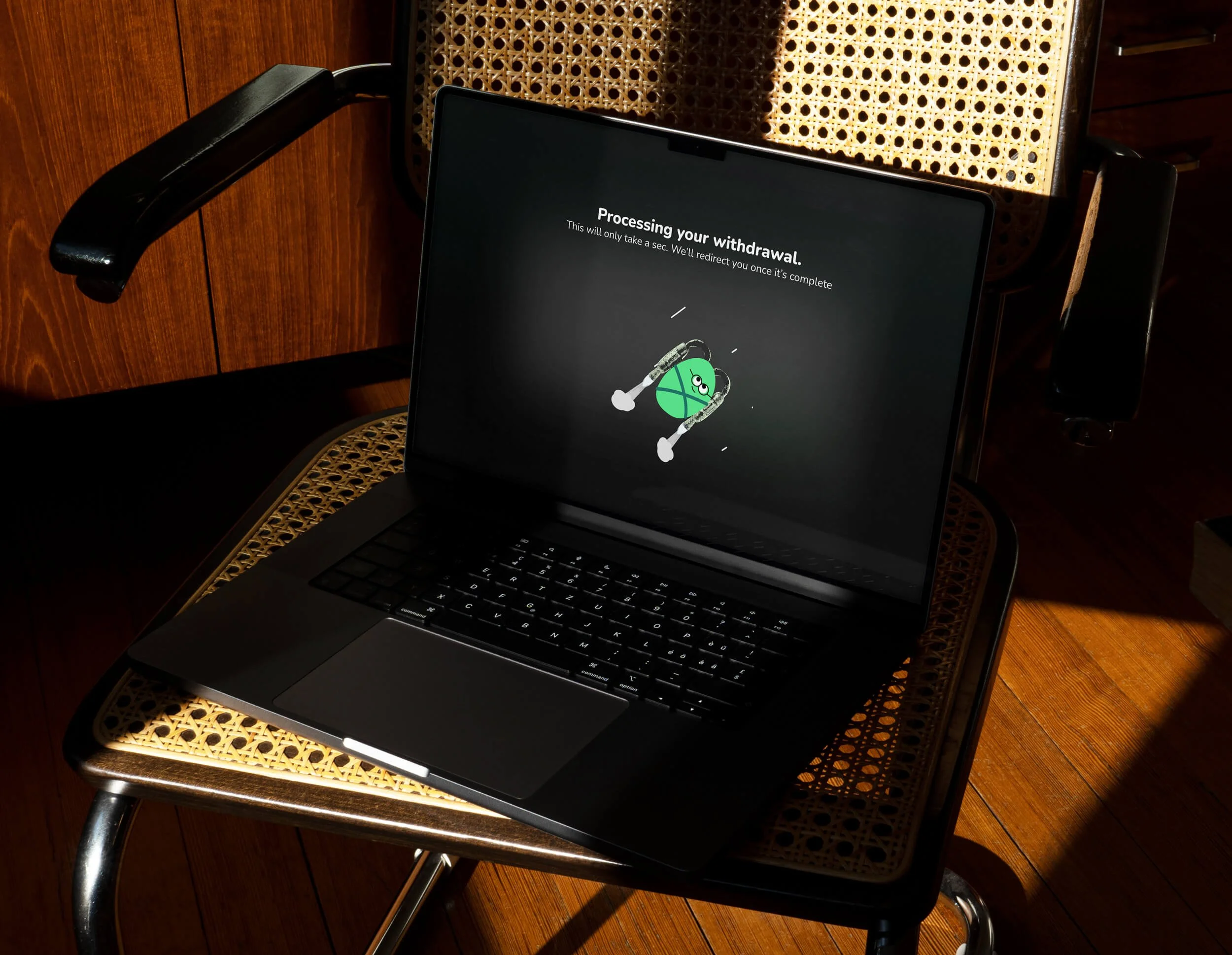
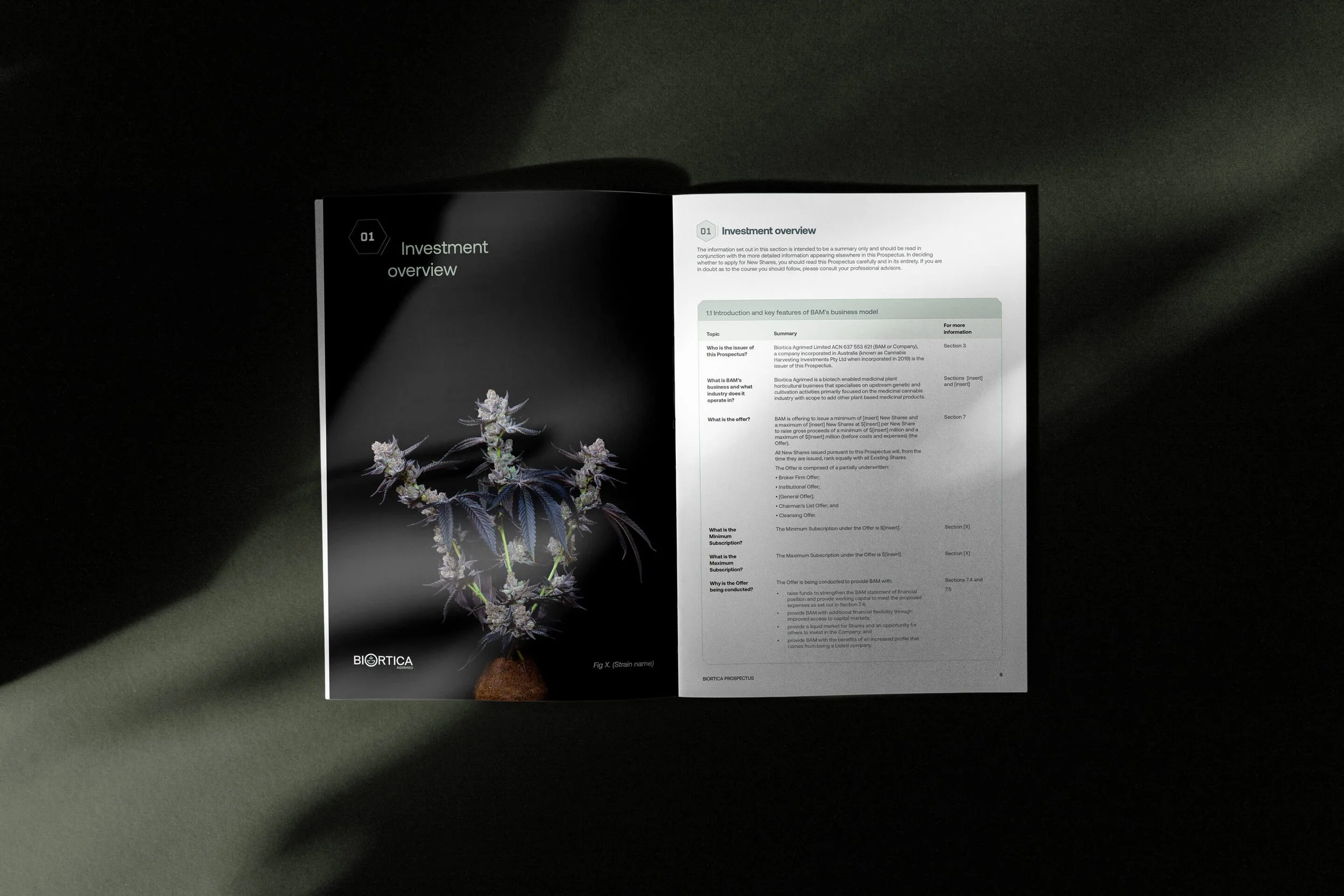
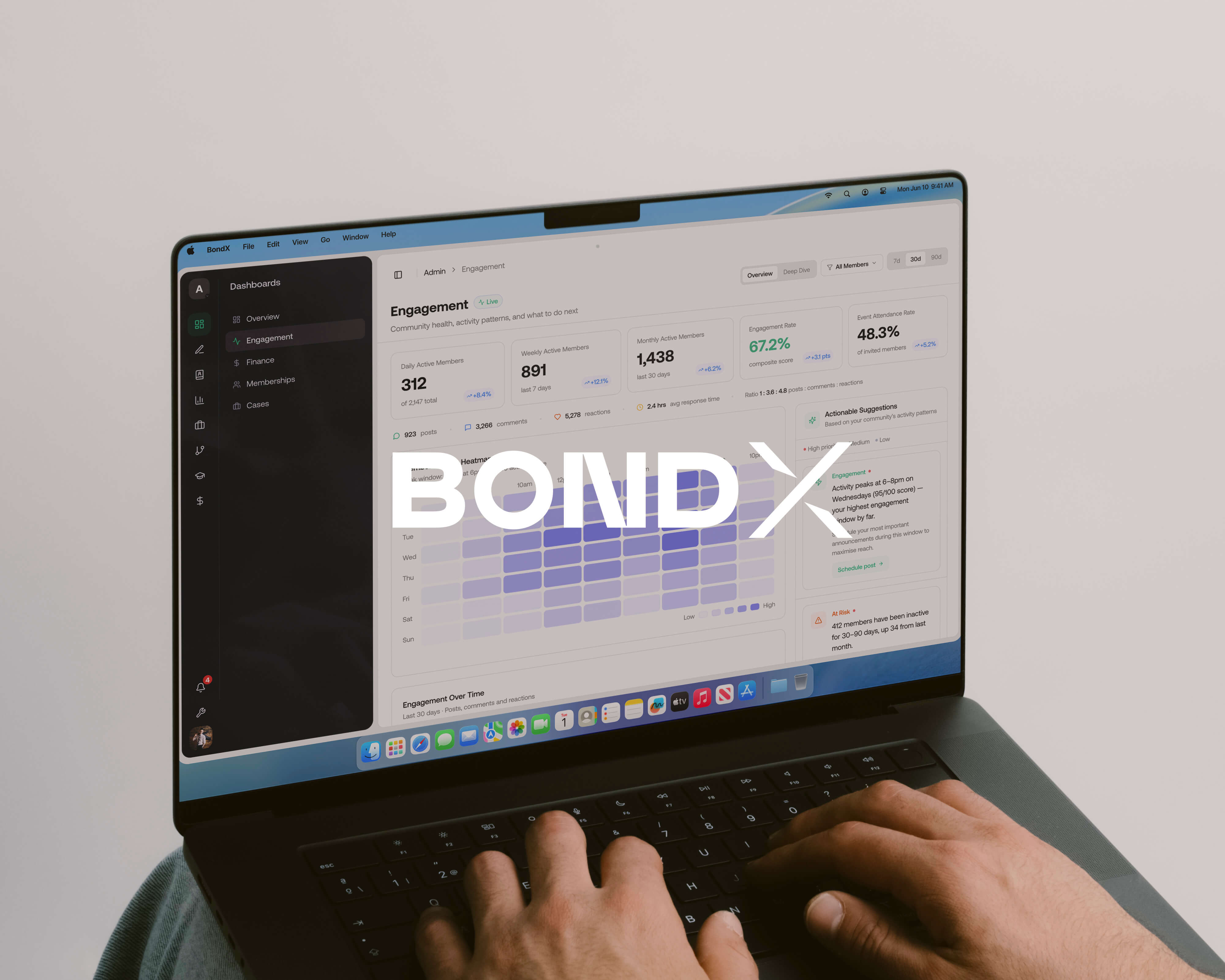
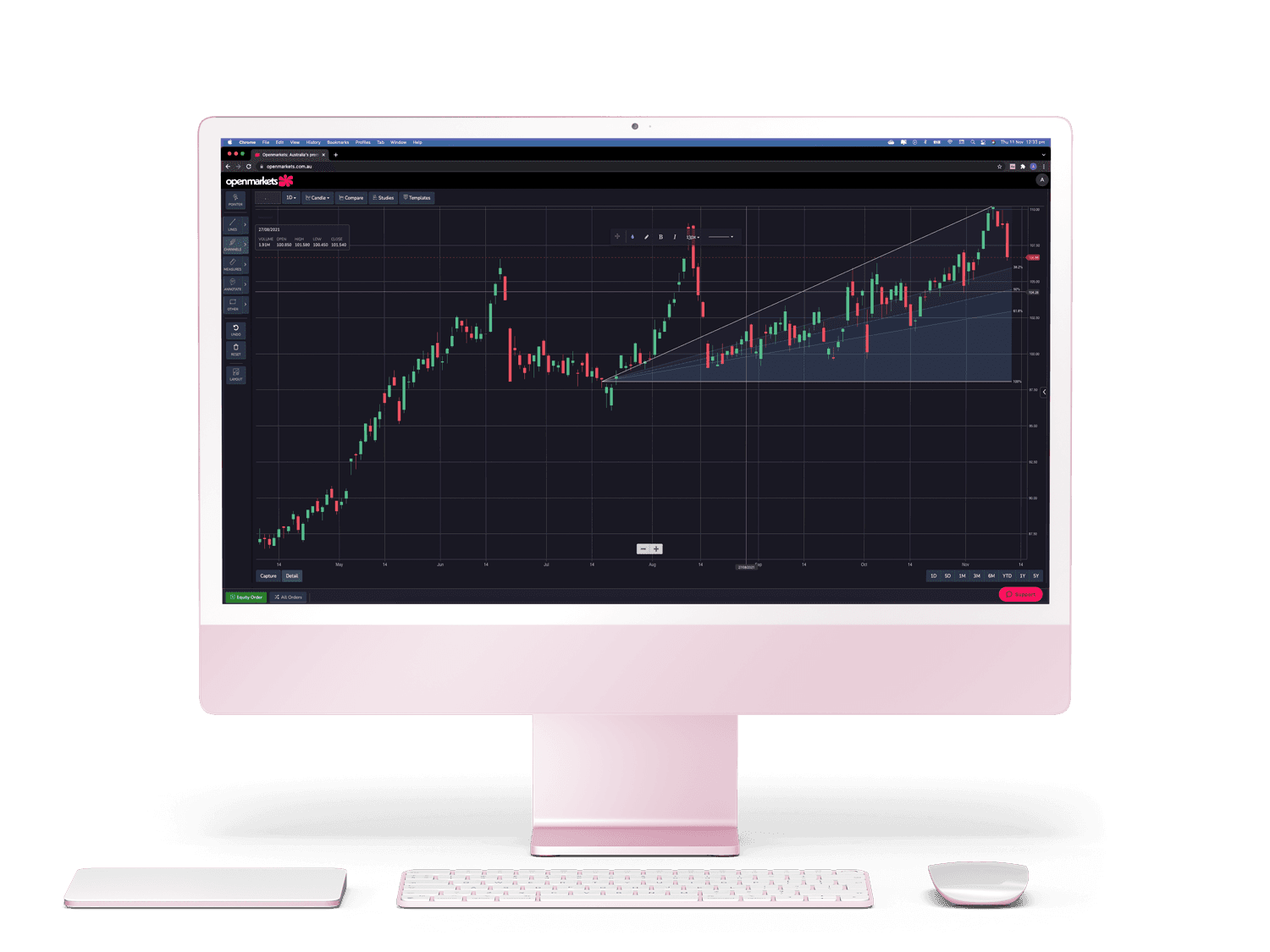
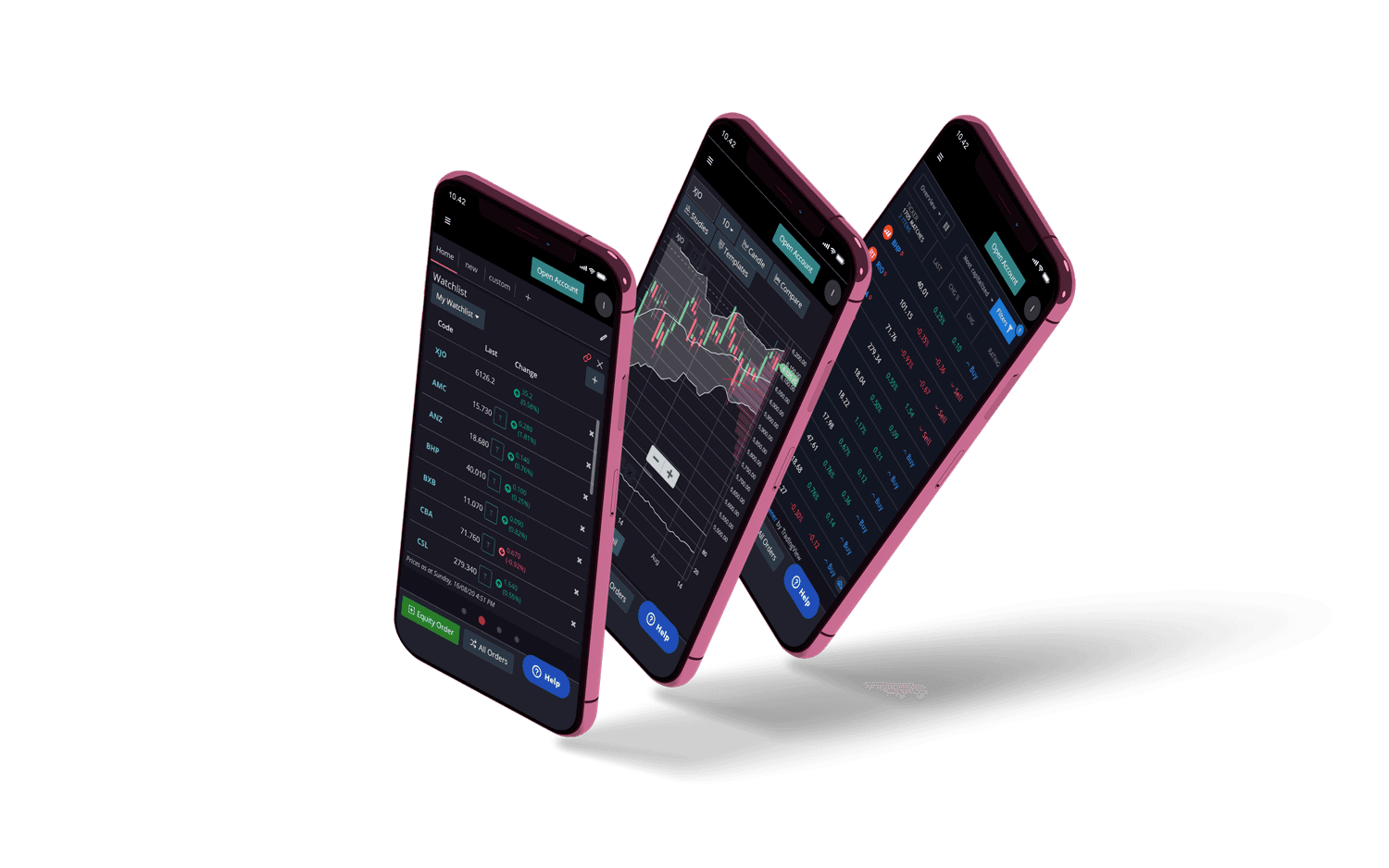
The flower system expanded into Omlets, small anthropomorphic creatures built from petal shapes. They were used as personalised support avatars to protect staff identity in feedback flows, as internal team avatars to build culture, and as characters in The Monthly Rap, a video series recapping the month in global markets. Over the year, the company grew its headcount by 500%, became the second largest clearing house in Australia and began fast-tracking its IPO process. During that period, we designed five websites, uplifted three products and rebranded a dense ecosystem of touchpoints across all three companies, including forms, reusable content, product surfaces, merchandise, motion and marketing assets.
Brand world and outcomes
From product uplift to a full-company identity system
The flower system expanded into Omlets, small anthropomorphic creatures built from petal shapes. They were used as personalised support avatars to protect staff identity in feedback flows, as internal team avatars to build culture, and as characters in The Monthly Rap, a video series recapping the month in global markets. Over the year, the company grew its headcount by 500%, became the second largest clearing house in Australia and began fast-tracking its IPO process. During that period, we designed five websites, uplifted three products and rebranded a dense ecosystem of touchpoints across all three companies, including forms, reusable content, product surfaces, merchandise, motion and marketing assets.